Accelerate Your
Business Decisions
Status meetings can be a drag. Use our simple dashboard during your team meetings to maximize the time you spend discussing what matters – solve your critical problems, capitalize on your opportunities.
Maximize the time you spend eliminating problems and amplifying your wins.
The problem with metrics and KPIs is that they contain a ton of data, and it's challenging to know what metrics to focus on. So you waste time reviewing numbers that don't matter. And you repeat this every time you meet. 😞
We built a simple tool that makes sense of your spreadsheets, so you can quickly and easily identify where you and your team need to focus and make smart decisions, faster.
Sign Up for FreePlans start at $10/mo. and include a 7-day no-risk free trial.

How does it work?
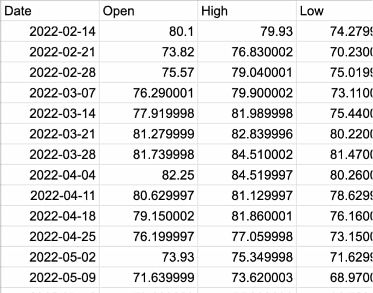
The tool works with any times-series data (ie, daily sales) that can be read as CSV. You can easily connect your Google Sheets and track what's going right — and wrong — so your team can focus on delivering real value.
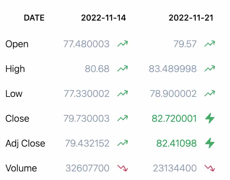
More of the good, less bad
- Cells that are well above normal are highlighted in green. You should focus on allocating resources to amplify these metrics.
- Cells that are well below normal are highlighted in red. You should focus on remediating issues immediately.
- Cells that are slightly above or below normal are not highlighted. You should only discuss these metrics if you have extra time.
Where did this come from?
It's actually been around for quite a while. Our technique is inspired from the XmR chart. What's that? Let's ask ChatGPT:
The XmR chart is useful for identifying whether a process is stable or unstable. The XmR chart can be used to identify trends, shifts, and outliers in the data, which can help in identifying the root cause of process problems and taking corrective actions.
The XmR chart is widely used in manufacturing, healthcare, and other industries where process control is critical for ensuring high-quality products and services.
Only problem is, they're kind of difficult to make if you're not an Excel guru. And we're not Excel gurus. So we made this.
Our tool works with any time series data you keep in a spreadsheet: daily sales, weekly profits, click-thrus, whatever. We process it so that you can easily see where you're winning and where you're losing.
Connect published Google Sheets or import private Sheets when you connect your Google account. We pull in any updates automatically on a schedule, so you're always ready for your next team meeting.
Plans start at $10/mo. and include a 7-day no-risk free trial.
Here's some inspiration for how to think differently about what you should be getting from your dashboards and metrics.
©2024 Bitsmachine. All rights reserved. Privacy Policy Terms